96
ul > li {
text-indent: -1em;
}
body, td {font-family: Arial, Helvetica, sans-serif;}
.hse-body-wrapper-table {background-color: #f2f3f5}
.moz-text-html .hse-column-container{max-width:600px !important;width:600px !important}
.moz-text-html .hse-column{display:table-cell;vertical-align:top}.moz-text-html .hse-section .hse-size-3{max-width:150px !important;width:150px !important}
.moz-text-html .hse-section .hse-size-6{max-width:300px !important;width:300px !important}
.moz-text-html .hse-section .hse-size-12{max-width:600px !important;width:600px !important}
[owa] .hse-column-container{max-width:600px !important;width:600px !important}[owa] .hse-column{display:table-cell;vertical-align:top}
[owa] .hse-section .hse-size-3{max-width:150px !important;width:150px !important}
[owa] .hse-section .hse-size-6{max-width:300px !important;width:300px !important}
[owa] .hse-section .hse-size-12{max-width:600px !important;width:600px !important}
@media only screen and (min-width:640px){.hse-column-container{max-width:600px !important;width:600px !important}
.hse-column{display:table-cell;vertical-align:top}.hse-section .hse-size-3{max-width:150px !important;width:150px !important}
.hse-section .hse-size-6{max-width:300px !important;width:300px !important}.hse-section .hse-size-12{max-width:600px !important;width:600px !important}
}@media only screen and (max-width:639px){img.stretch-on-mobile,.hs_rss_email_entries_table img,.hs-stretch-cta .hs-cta-img{height:auto !important;width:100% !important}
.display_block_on_small_screens{display:block}.hs_padded{padding-left:20px !important;padding-right:20px !important}
ul,blockquote{margin:0;padding:1em 40px}}@media screen and (max-width:639px){.social-network-cell{display:inline-block}
}
Offices are consistently changing; some of the newest trends include:
- Open and collaborative spaces – eliminating barriers and promoting teamwork, communication, and creativity
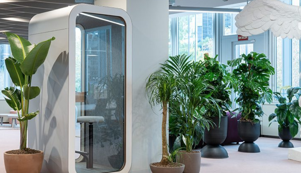
- Flexible workstations – offering options for standing, sitting, and collaborative work, as well as private spaces for individual work or meetings
- Tech integration – implementing digital tools, ergonomic furniture, and adjustable lighting to enhance productivity and comfort
- Wellness features – integrating amenities like gyms, meditation spaces, and healthy snack options to promote employee health and well-being
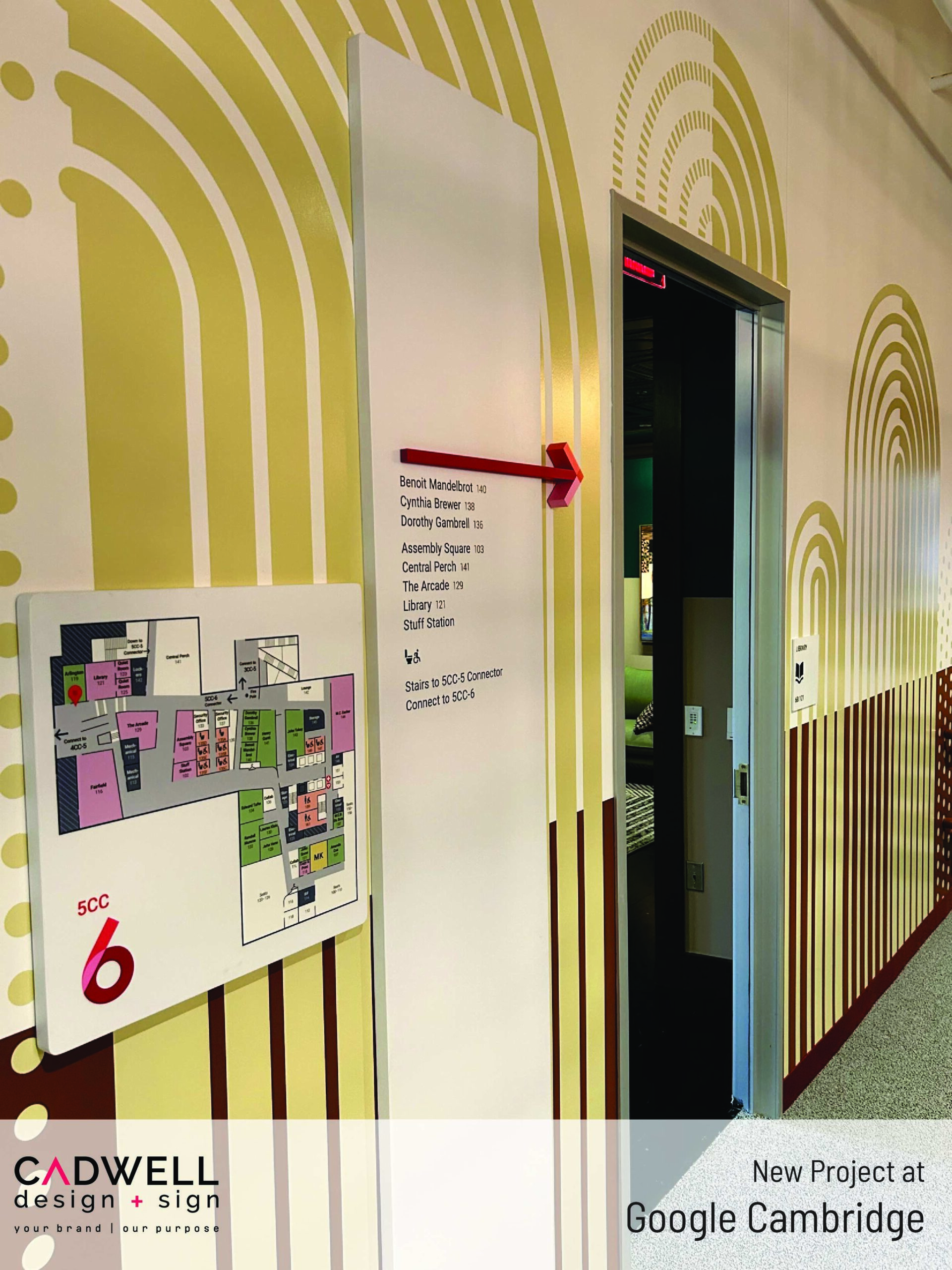
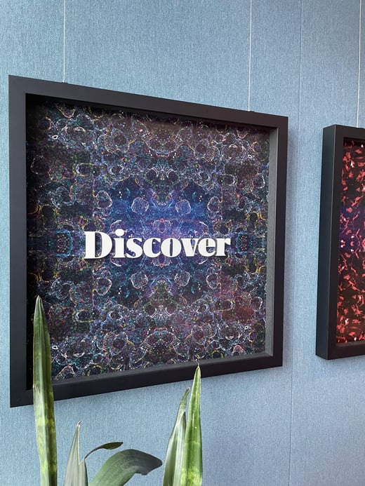
- Bold colors and textures – using vibrant colors, patterns, and textures to infuse energy and personality into the office space
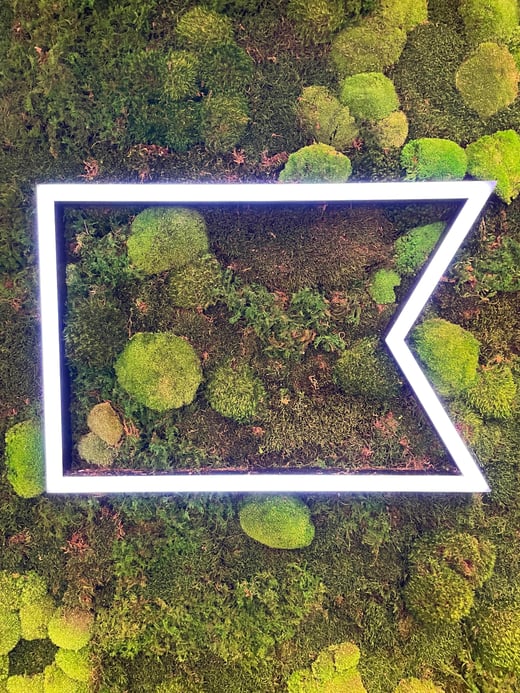
- Sustainable design – utilizing eco-friendly materials, energy-efficient lighting, and sustainable practices to reduce the office’s carbon footprint.
Share This Story, Choose Your Platform!
Page load link
| | | | | | | |




.png?width=1120&upscale=true&name=rsandh-corporate-office-design-trends-associate-feedback%20(1).png)